In order to consistently make money in the markets, traders need to learn how to identify an underlying trend and trade around it accordingly. Common clichés include: “trade with the trend”, “don’t fight the tape” and “the trend is your friend”.
Trends can be classified as primary, intermediate and short term. However, markets exist in several time frames simultaneously. As such, there can be conflicting trends within a particular stock depending on the time frame being considered. It is not out of the ordinary for a stock to be in a primary uptrend while being mired in intermediate and short-term downtrends.
Typically, beginning or novice traders lock in on a specific time frame, ignoring the more powerful primary trend. Alternately, traders may be trading the primary trend but underestimating the importance of refining their entries in an ideal short-term time frame. Read on to learn about which time frame you should track for the best trading outcomes.
What time frames should you be tracking?
A general rule is that the longer the time frame, the more reliable the signals being given. As you drill down in time frames, the charts become more polluted with false moves and noise. Ideally, traders should use a longer time frame to define the primary trend of whatever they are trading.
Once the underlying trend is defined, traders can use their preferred time frame to define the intermediate trend and a faster time frame to define the short-term trend. Some examples of putting multiple time frames into use would be:
- A swing trader, who focuses on daily charts for his or her decisions, could use weekly charts to define the primary trend and 60-minute charts to define the short-term trend.
- A day trader could trade off of 15-minute charts, use 60-minute charts to define the primary trend and a five-minute chart (or even a tick chart) to define the short-term trend.
- A long-term position trader could focus on weekly charts while using monthly charts to define the primary trend and daily charts to refine entries and exits.
The selection of what group of time frames to use is unique to each individual trader. Ideally, traders will choose the main time frame they are interested in, and then choose a time frame above and below it to complement the main time frame. As such, they would be using the long-term chart to define the trend, the intermediate-term chart to provide the trading signal and the short-term chart to refine the entry and exit. One note of warning, however, is to not get caught up in the noise of a short-term chart and over analyze a trade. Short-term charts are typically used to confirm or dispel a hypothesis from the primary chart.
Trade Example
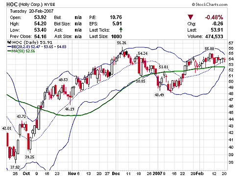
Holly Corp. (NYSE: HOC) began appearing on some of our stock screens earlier this year as it approached its 52-week high and was showing relative strength versus other stocks in its sector. As you can see from the chart below, the daily chart was showing a very tight trading range forming above its 20- and 50-day simple moving averages. The Bollinger Bands® were also revealing a sharp contraction due to the decreased volatility and warning of a possible surge on the way. Because the daily chart is our preferred time frame for identifying potential swing trades, the weekly chart would need to be consulted to determine the primary trend and verify its alignment with our hypothesis.
 |
| Chart by StockCharts.com |
| Figure 1 |
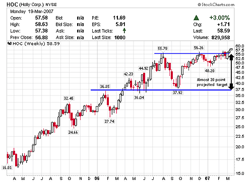
A quick glance at the weekly revealed that not only was HOC exhibiting strength, but that it was also very close to making new record highs. Furthermore, it was showing a possible partial retrace within the established trading range, signaling that a breakout may soon occur.
The projected target for such a breakout was a juicy 20 points. With the two charts in synch, HOC was added to our watch list as a potential trade. A few days later, HOC attempted to break out and, after a volatile week and a half, HOC managed to close over the entire base.
 |
| Chart by StockCharts.com |
| Figure 2 |
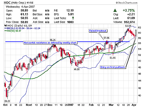
HOC was a very difficult trade to make at the breakout point due to the increased volatility. However, these types of breakouts usually offer a very safe entry on the first pullback following the breakout. When the breakout was confirmed on the weekly chart, the likelihood of a failure on the daily chart would be significantly reduced if a suitable entry could be found. The use of multiple time frames helped identify the exact bottom of the pullback in early April 2007. The chart below shows a hammer candle being formed on the 20-day simple moving average and mid Bollinger Band® support. It also shows HOC approaching the previous breakout point, which usually offers support as well. The entry would have been at the point at which the stock cleared the high of the hammer candle, preferably on an increase in volume.
 |
| Chart by StockCharts.com |
| Figure 3 |
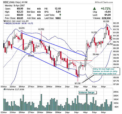
By drilling down to a lower time frame, it became easier to identify that the pullback was nearing an end, and that the potential for a breakout was imminent. Figure 4 shows a 60-minute chart with a clear downtrend channel. Notice how HOC was consistently being pulled down by the 20-period simple moving average. An important note is that most indicators will work across multiple time frames as well. HOC closed over the previous daily high in the first hour of trading on April 4, 2007, signaling the entry. The next 60-minute candle clearly confirmed that the pullback was over, with a strong move on a surge in volume.
 |
| Chart by StockCharts.com |
| Figure 4 |
The trade can continue to be monitored across multiple time frames with more weight assigned to the longer trend.
Figure 5 shows how the HOC target was met.
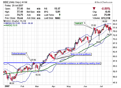 |
| Chart by StockCharts.com |
| Figure 5 |
Summary
By taking the time to analyze multiple time frames, traders can greatly increase their odds for a successful trade. Reviewing longer term charts can help traders to confirm their hypotheses but, more importantly, it can also warn traders of when the separate time frames are in disaccord. By using narrower time frames, traders can also greatly improve on their entries and exits. Ultimately, the combination of multiple time frames allows traders to better understand the trend of what they are trading and instil confidence in their decisions.
Ready to learn more? Check out this article on harmonic price patterns.
